The reference combines dark nails with a mottled brown-and-black pattern. Decide whether you want the contrast across the full set or on a few accent nails. For a shorter version, keep the pattern visible by using fewer, larger patches rather than very fine marks.
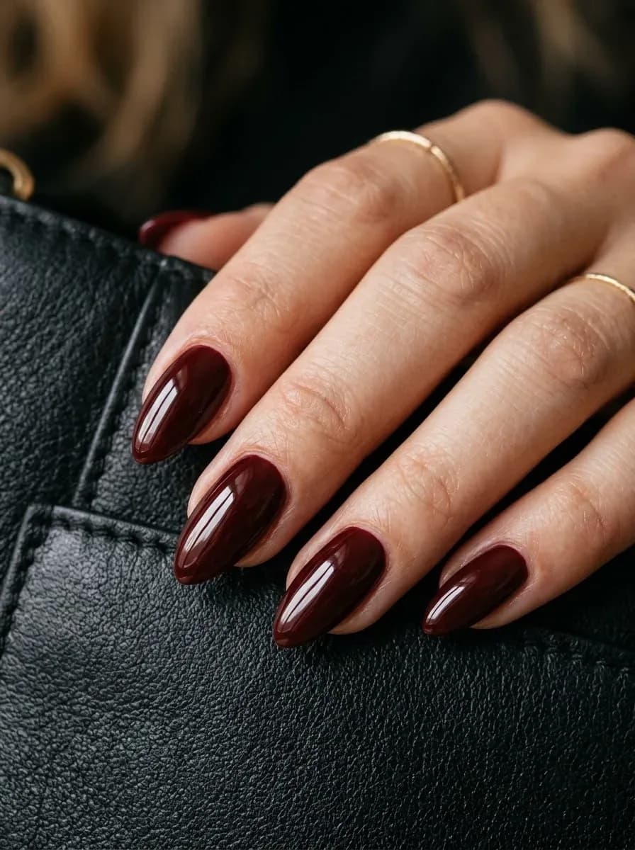
Here the dark color makes the tapered outline the main feature. Ask for the amount of taper you want, as well as the length. If keeping your natural length is a priority, discuss a less pointed version rather than assuming extensions are necessary.
The useful details are the contrast between blue, white, and gold-colored marks, and the placement of the abstract pattern. Tell the artist which lines you want to retain. For less artwork, keep the color palette and place the pattern on one or two nails.
The contrasting tips are the focal point of this white, purple, and dark-colored reference. Point out both the marbled effect and how much of the nail it occupies. On a shorter version, choose whether the tip width or the pattern detail matters more.
Compare the placement of the accent against the neutral base, rather than treating the whole photograph as a fixed design. Ask for a similar balance of empty space and artwork at your preferred length. The exact application technique needs confirmation from the creator.
The red color and tapered outline can be chosen independently. Compare red swatches for depth and warmth, then show the artist how rounded you want the point to be. There is no need to copy the reference length to keep the color idea.
Use this reference to specify a red edge against a lighter base. The width and curve of the tip affect the result as much as the red shade. Ask for a finer edge if you want more of the base visible on a short nail.
This red-and-gold reference can help you explain where you want sparkle placed. Decide whether it should cover an accent nail, appear at the tips, or be distributed across the set. Confirm the particle size and coverage with a sample if available.
This reference pairs a red shade with a tapered silhouette. Camera settings can change how warm or cool the red appears, so compare real swatches if the shade matters. Specify a rounded point and your preferred length separately.
The contrast between a pale base and a white edge defines this French-tip reference. Show your artist the curve and thickness of the edge you like. On shorter nails, a narrower tip can leave more of the base visible.
The blue-and-white transition is the detail to retain in this ombre reference. Specify the direction of the blend and where each color should be strongest. Confirm matte or glossy separately, since the photographed lighting can soften reflections.